The Kitchen
A Food Ordering App

The Product
The Kitchen is a local restaurant offering healthy and delicious meal options at competitive prices for pickup and delivery through online orders. This app is perfect for busy professionals who want to eat healthy but don't have the time to prepare meals at home. They want consistency in their meals and ability to schedule delivery days in advance.
Background
I created this app mockup as a solution to a problem I faced in my own daily life. As a busy parent, I always struggled to make healthy meals at home for my family of 4. I wanted to enjoy delicious and nutritious food without having to cook it myself or spend a fortune at a restaurant. That's where The Kitchen comes in.
Project duration
4 weeks, August 2023
Tool:
Figma
My Role
UX UI Designer for The Kitchen app from conception to delivery.
THE PROBLEM
Busy professionals with focus on their career and family struggle to find time to do meal preps at home on a regular basis.
THE GOAL
Provide users an easy way to order meals regularly for pickup or delivery.
Create an experience that is Usable, Equitable, Enjoyable and Useful.
MY RESPONSIBILITIES
User Research
Ideation & Sketching
Wireframing & Prototyping
Visual Design
Accounting for accessibility
Testing & Iteration
UNDERSTANDING THE USER
EMPATHIZE & DEFINE
RESEARCH | EMPATHY MAP | USER PAIN POINTS | PERSONAS | PROBLEM STATEMENTS | USER JOURNEY MAP
RESEARCH
USERS
MY TARGET AUDIENCE ARE
23 - 45 year old professionals and students who are too busy to regularly meal prep for themselves or family and just want consistency and reliability in ordering meals.
PROBLEMS
THEIR CHALLENGES ARE
accessibility,
affordability,
timely notifications,
overall efficiency.

WHY
I WANT TO ADDRESS THESE PROBLEMS TO
increase frequent online orders from The Kitchen restaurant.
enhance user experience
meet and exceed the restaurant business goals.
INTERVIEWS
10+ Participants
Varied age groups
professionals
homemakers
students
HOW
UX RESEARCH STUDY
well thought through question sets focused on understanding pain points, feelings, successes
unbiased & neutral tone, facial expressions, body language and choice of words
WHY
I WANT TO UNDERSTAND
user needs,
preferences,
goals, and
behaviors
while using food ordering apps.
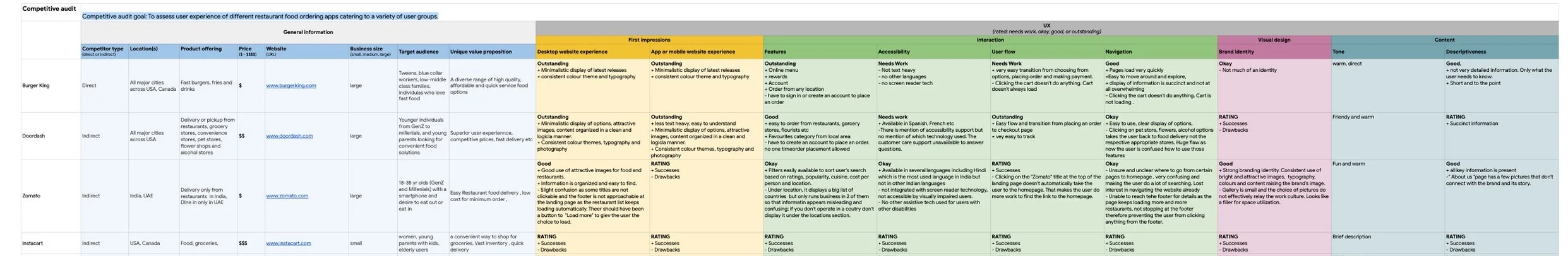
COMPETITIVE ANALYSIS

WHAT
COMPETITIVE AUDITS AMONG 4 LARGEST FOOD DELIVERY APPS
Doordash a largest food delivery company
Instacart a grocery delivery and pickup service for groceries
Burger King a multinational fast food chain with delivery option
Zomato an Indian multinational restaurant aggregator and food delivery company
WHY
To assess user experience of different restaurant food ordering apps catering to a variety of user groups.
To analyze competitors and industry trends to identify opportunities and potential challenges.
Competitive analysis of 4 existing businesses
GETTING TO KNOW THE USER
What I did : I observed 5 users to get a deeper understanding of their needs, pain points, feelings and behaviours.
How: With Empathy Maps, User Points, Personas, User Journey Map . I was able to get a better understanding of their needs by writing down User Stories, Goal Statements and If/Then statements.
USER PAIN POINTS
“I have a lot of responsibilities which don’t allow me time for grocery shopping, planning and preparing meals.”

“I don’t see many food options within a preferred price range as my decisions are driven by cost.”

“Some food apps lack assistive technology, making it less accessible for users like me with disabilities.”

"I require timely notifications for order preparation, delivery distance, exact drop-off location, and a reference picture or a call from the delivery person for a seamless in-hand drop-off."

PERSONAS
40 yrs, gym teacher, part-time pianist

Anne
Anne, a middle school gym teacher and part-time hotel pianist, enjoys outdoor activities with family. She seeks a reliable, budget-friendly food app for weekday orders and prefers a screen-reader-friendly interface with minimal text as she has a visual impairment.
Problem Statement
Anne is a busy middle school gym teacher who seeks an app with screen-reader support and minimal text for budget-friendly orders and efficient delivery tracking so that she can prioritize family and work and minimize time spent on cooking, which she finds unenjoyable.
Goals
To only choose a screen reader assistive app to feel successful at making meal decisions for my family.
To never worry about where the food is dropped off to maintain my focus and productivity.
To choose from affordable food options to stay within the budget.
Frustrations
“Not too many screen reader tech apps out there so my options are limited.”
“At different delivery locations I don’t know where to look for my order when it’s dropped off.”
“ I love working 2 jobs and being with my family but don’t like cooking.
I prefer ordering food and saving time to be more productive as a teacher and a mom.“

Taylor
27 yrs, lawyer at a big law firm
Taylor, a busy lawyer aiming for a promotion, seeks an efficient and quick weekday food ordering solution to maintain a healthy lifestyle amid a hectic schedule.
Problem Statement
Taylor is a busy lawyer who needs an efficient app for quick meal orders and tracking so that they can prioritize career advancement as they have limited time for shopping and meal planning.
Goals
To make quick orders for pick-up/ delivery.
To have popular/ recommended food options to choose from.
To order for the week in advance.
To not worry about planning and preparing meals and only focus on work and activities.
Frustration
“It takes time in deciding what to order everyday.”
“I want to take on more responsibilities at work and build strong networks with my colleagues to get the next promotion. I don’t have time to plan meals.”

EMPATHY MAP
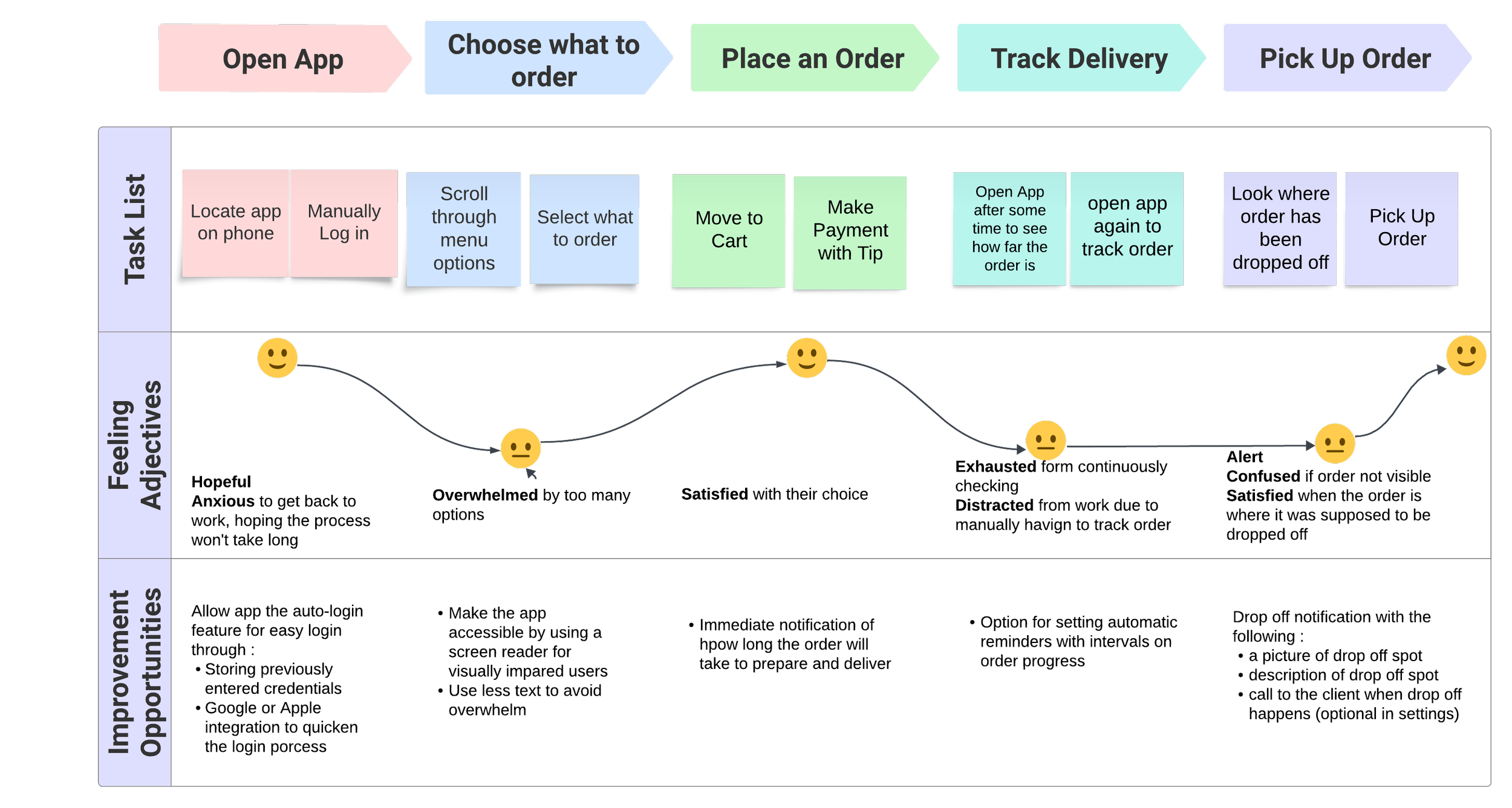
USER JOURNEY MAP
Goal: Place an order and pickup the order
BRAINSTORMING DESIGN IDEAS
IDEATING
STORYBOARDING | PAPER WIREFRAMES | DIGITAL WIREFRAMES | USABILITY STUDIES
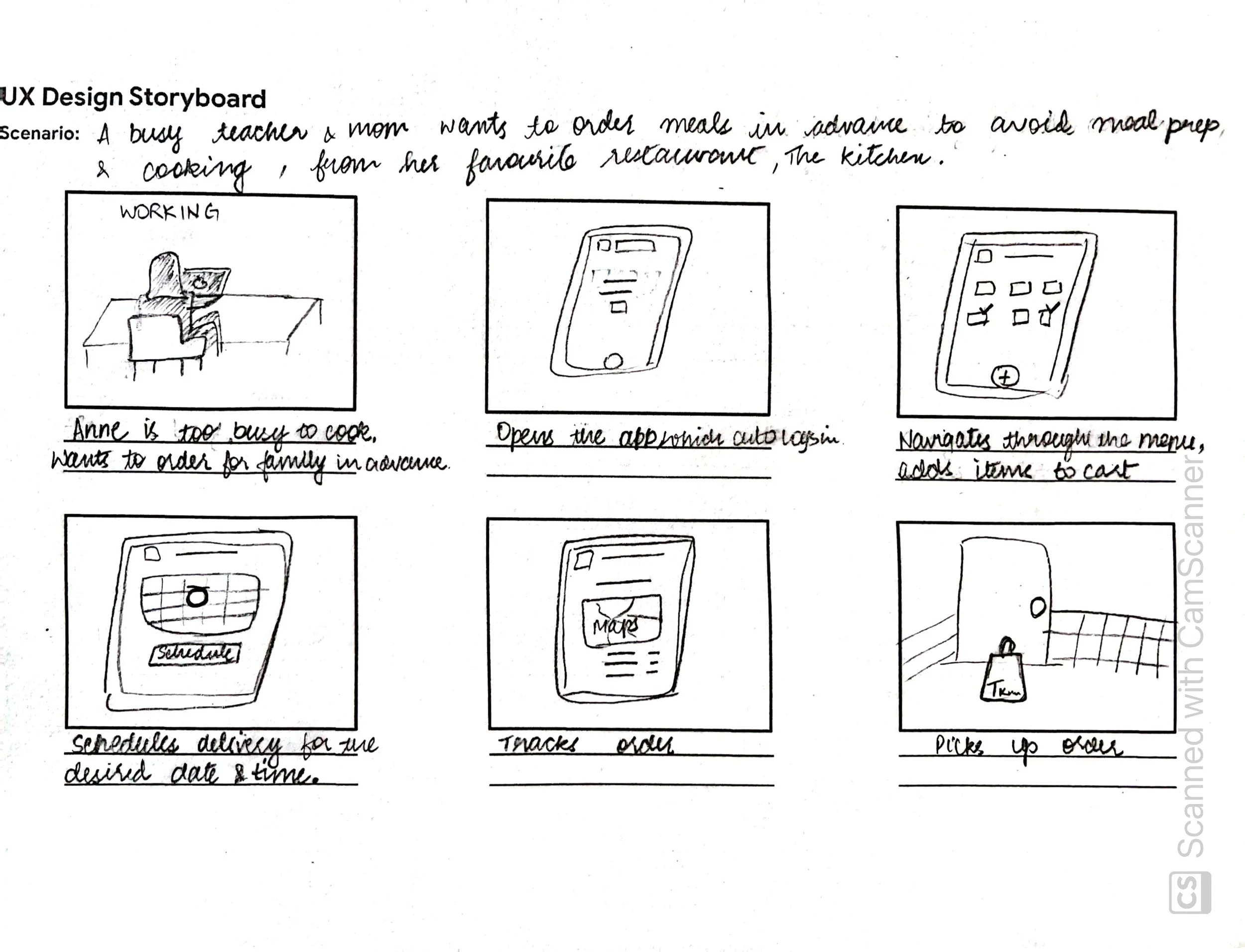
Through storyboarding, I was able to envision my user persona, Anne’s experience and journey from a point in her day when she decided to do something about meals for her family to the point when she picks up her order which she placed on the app seamlessly.
Through paper wire framing, I was able to go through various possible layouts of the app’s home screen and decide which parts would make for a good user experience.
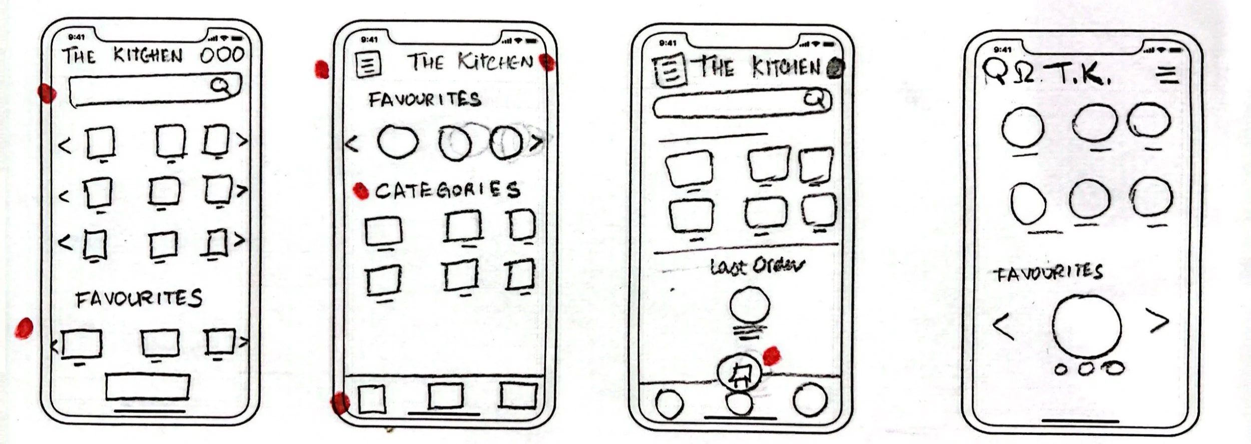
In this initial design phase, I based screen designs on feedback and insights generated from the user research.
I have continuously iterated on my designs based on feedback.
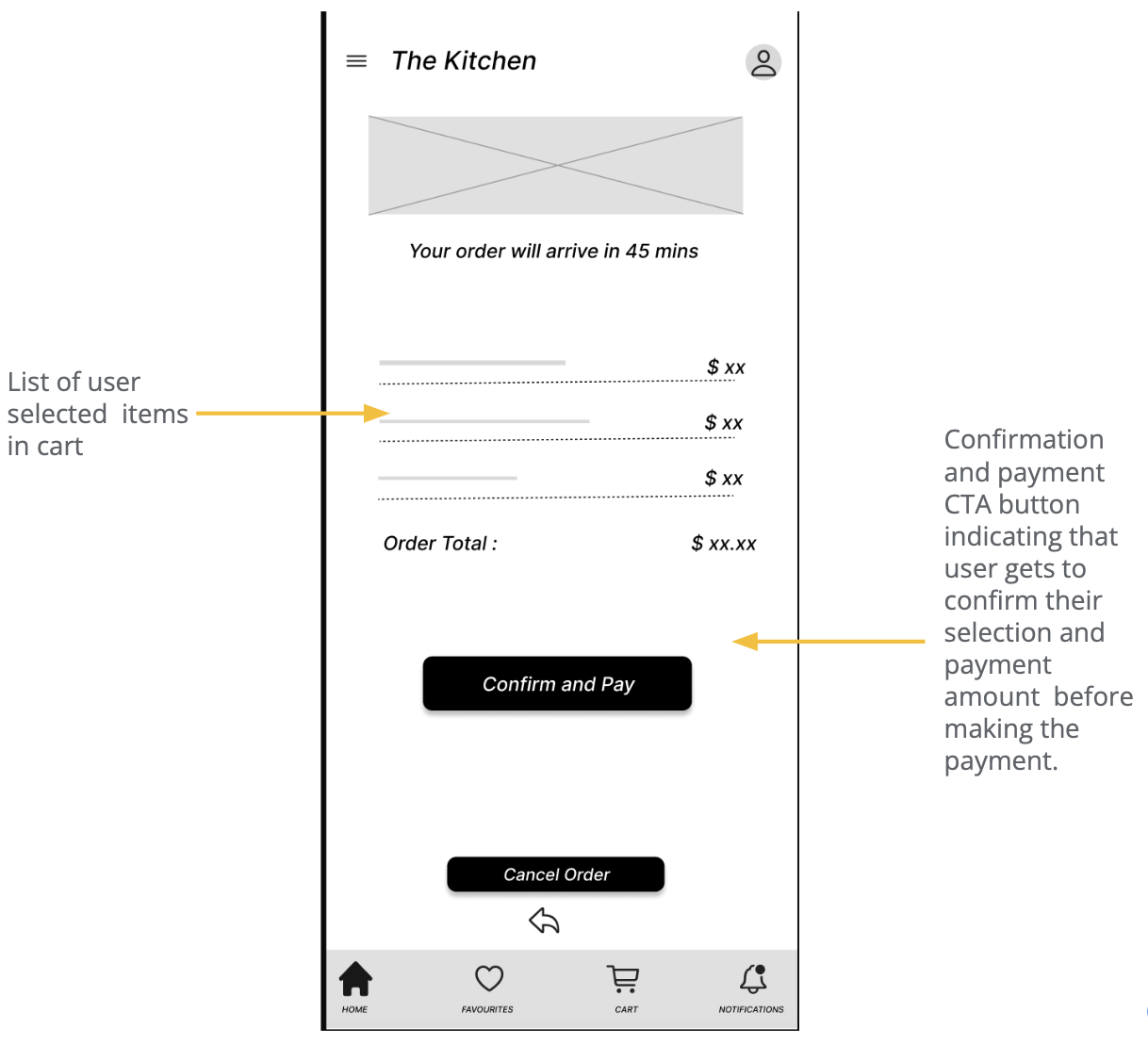
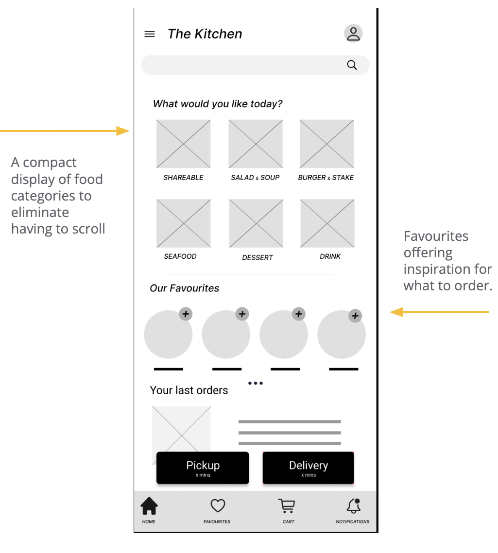
Cart design required some thought as to what all items were important. The minimalist appearance helps make better and faster decisions. It also avoids the feeling of overwhelm.
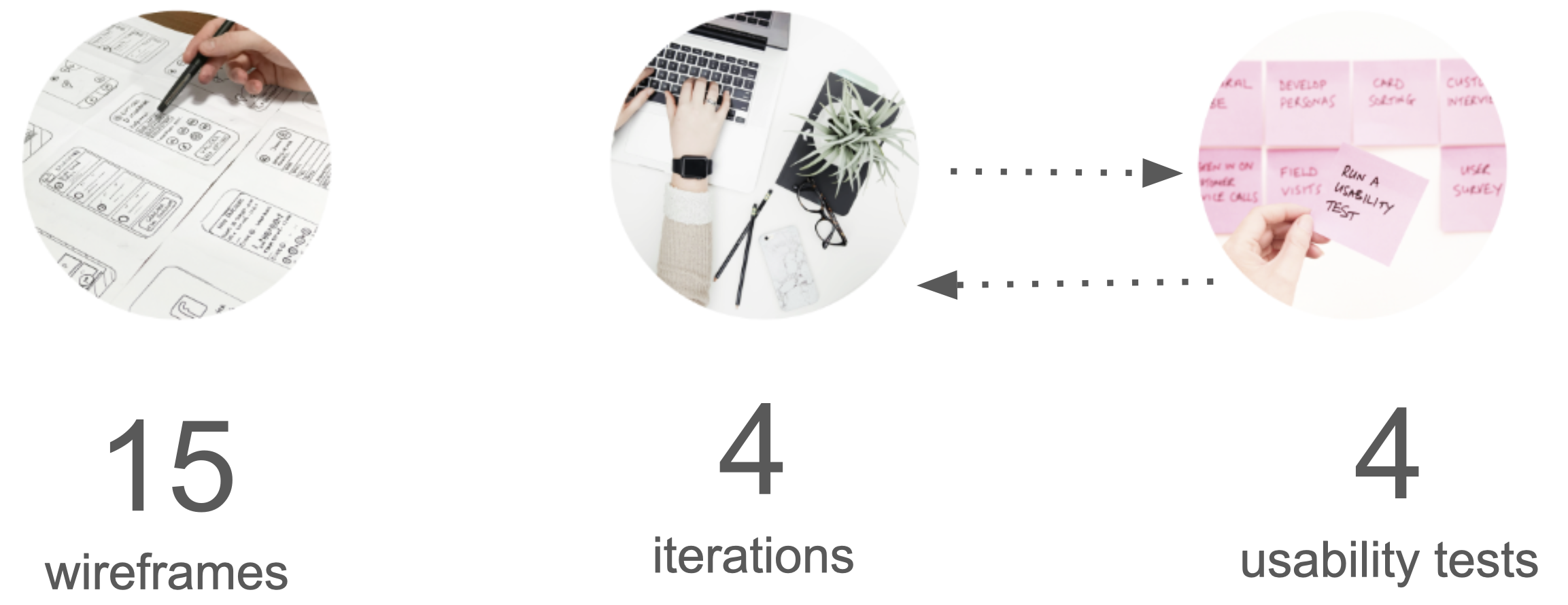
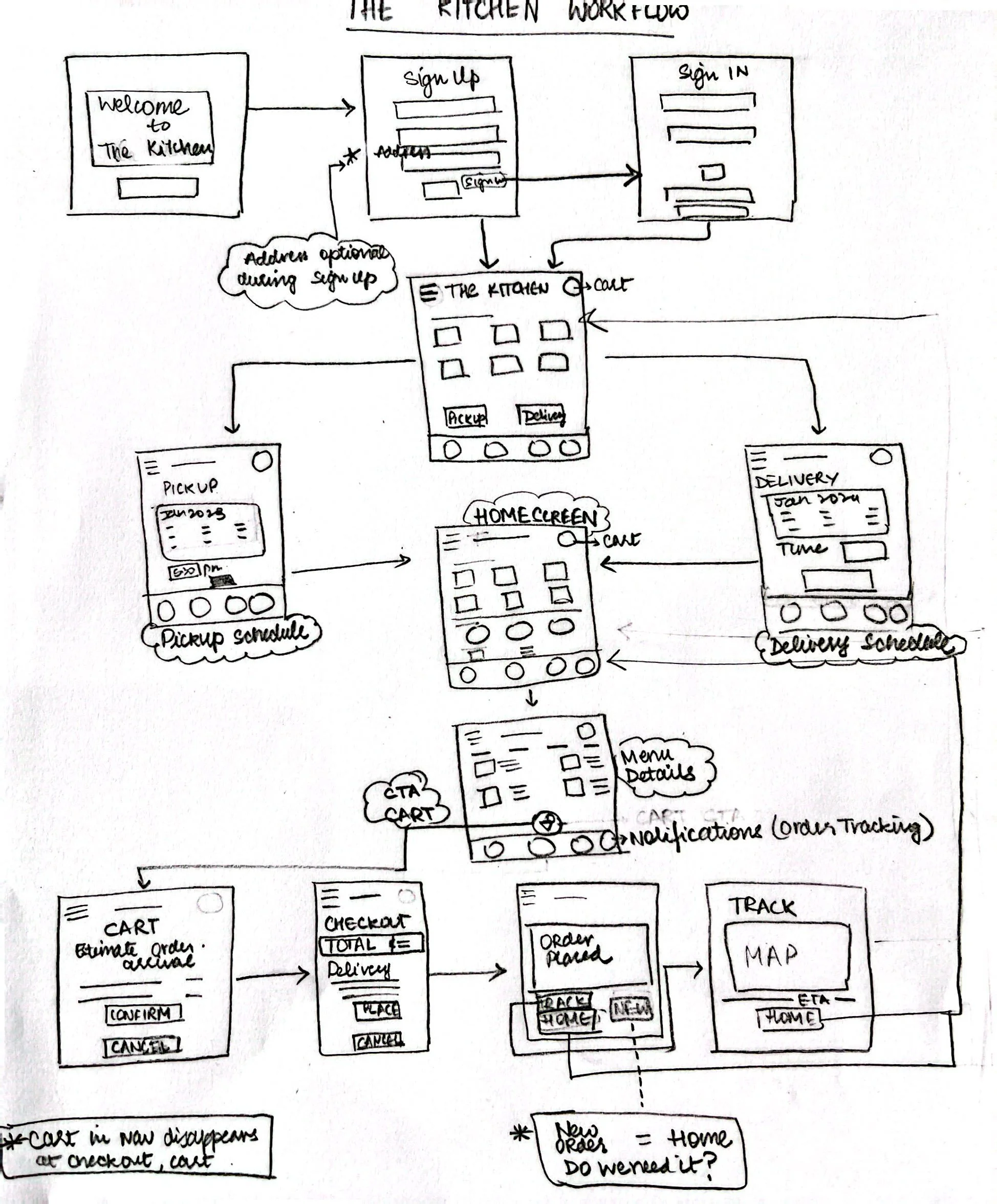
Digital Wireframes


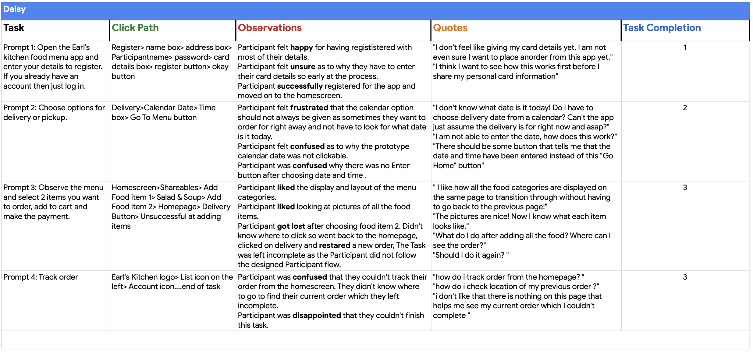
USABILITY STUDIES
What I did:
Conducted two rounds of usability studies.
Findings from the first study helped guide the designs from wireframes to mockups.
The second study used a high-fidelity prototype and revealed what aspects of the mockups needed refining.
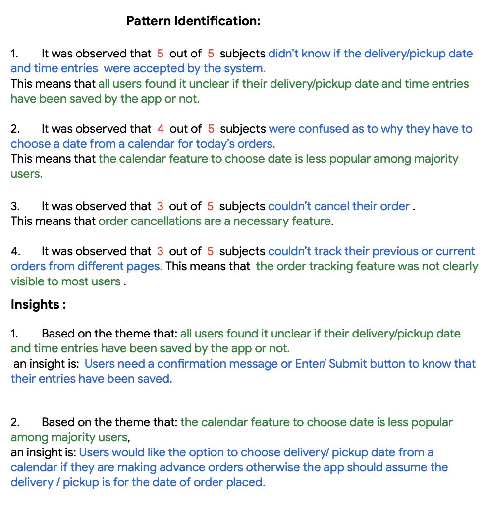
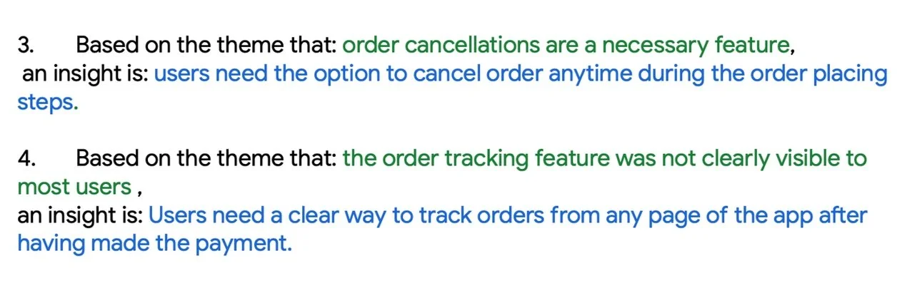
Did Pattern Identification by generating Themes, Insights and Priorities from Affinity mapping to get a clear idea of how to improve designs.


Design updates from Usability Study findings:

BEFORE Usability Study 1
AFTER Usability Study 2
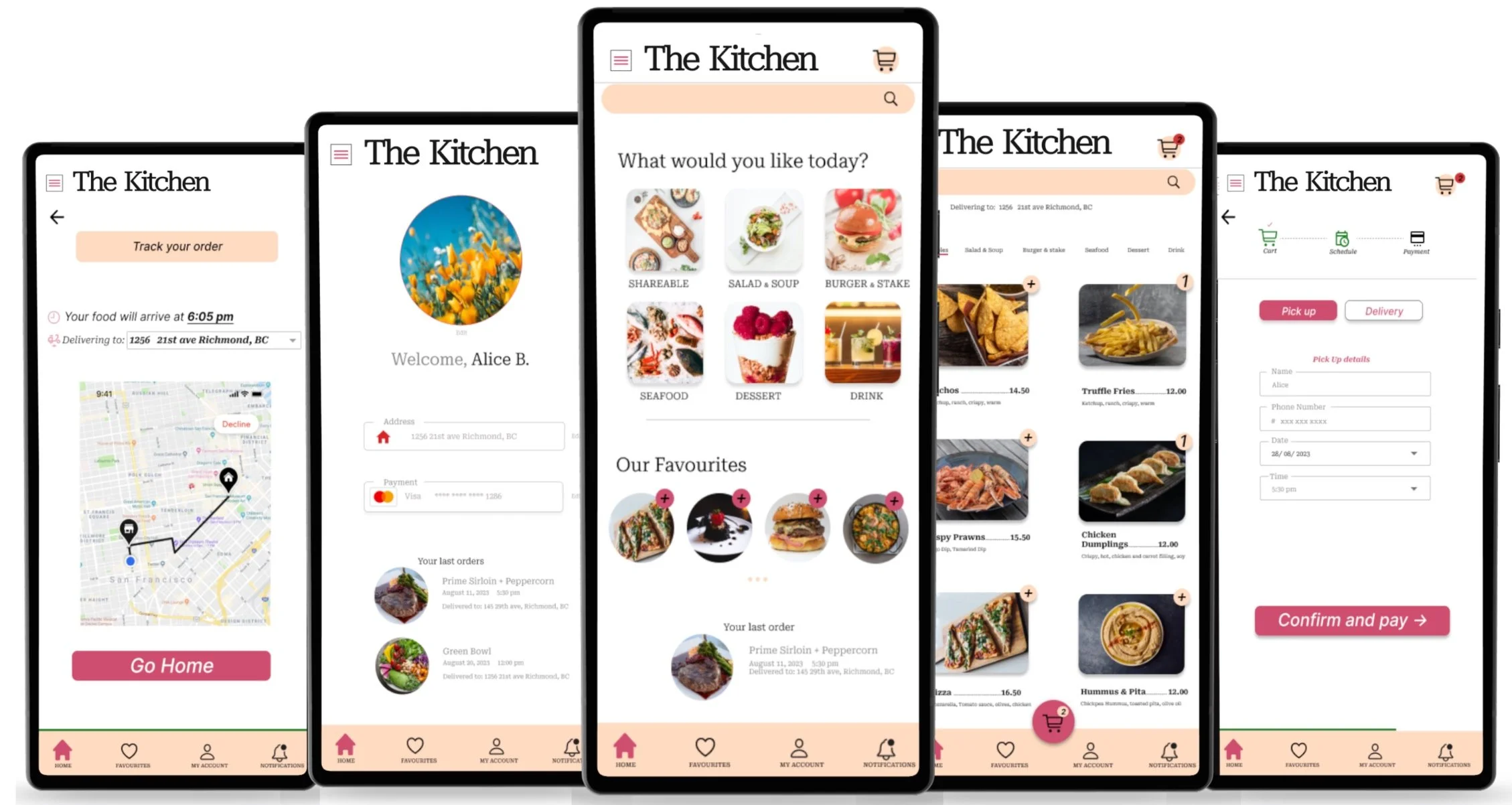
Added a progress bar to indicate users where they are in the completion process.
Displayed all the cart items and payment method on the same page to minimize confusion and add efficiency.
AFTER Usability Study 1
Added a “Cancel Order“ CTA button to allow flexibility to cancel a any time from any page to users.

BEFORE Usability Study 2
AFTER Usability Study 2
For improved usability, participants preferred the inclusion of the day of the week alongside the date.
As a result, I replaced the scroll date picker with a calendar display on both Pickup and Delivery pages.
Additionally, I ensured consistency by aligning the style of the time picker with the date picker
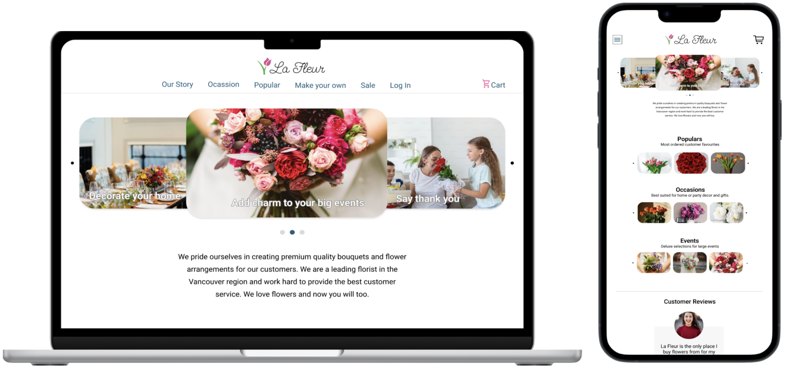
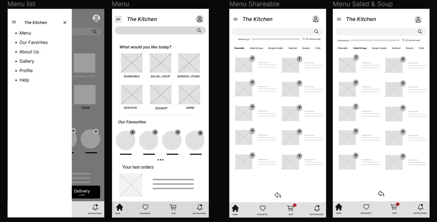
The Kitchen Restaurant App Mockups


KEY TAKEAWAYS
IMPACT | WHAT I LEARNED | NEXT STEPS
IMPACT
The app allowed participants to schedule their orders from start to completion, saving them time and effort in planning meals.
WHAT I LEARNT
Design evolution is inherent as I progress.
Usability tests and user feedback shape each iteration and are instrumental in creating a product that serves user needs better.
No matter how good designs look, if they don’t serve the user needs or solve for the problem, they are of no use.
NEXT STEPS
Further user research to identify additional features or necessary adjustments to enhance the product and increase accessibility.
Another round of usability studies to check if all issues are addressed.
Recruit participants with disabilities to increase accessibility and usability across diverse groups users.