LA FLEUR
A Flower Delivery responsive website
The Product
La Fleur is a flower delivery responsive website showcasing an extensive array of meticulously curated bouquets, presented in an enticing and user-friendly interface. Users also have the ability to add extra items from a curated and popular collection of local treats such as chocolates, cupcakes, balloons and teddys.
Project duration
4 weeks, September 2023
Tool:
Figma
My Role
UX UI Designer for La Fleur from conception to delivery including User Research, Ideation & Sketching, Wireframing & Prototyping, Visual Design, Accounting for accessibility, Testing & Iteration.
The Problem
How can I make online flower shopping a pleasant and less overwhelming experience?
Why did I choose to design this product?
During the pandemic, when physical gatherings were restricted and distances felt greater than ever, I turned to online flower deliveries as a way to express love and support to family and friends.
However, I was disappointed by the lack of meaningful options and clunky interfaces offered by existing platforms, which often left me feeling disconnected from the heartfelt sentiment I wished to convey. I felt compelled to create a flower delivery app that goes beyond mere functionality.
My goal is to redefine the online flower-gifting experience and bridging the gap between physical distance and emotional connection in our increasingly digital world.

Before I started the designs I wanted to get a better understanding of the users
In conducting a moderated user research study, my aim was to gain deeper insights into users' perceptions and experiences when purchasing flowers online versus from a physical florist shop.
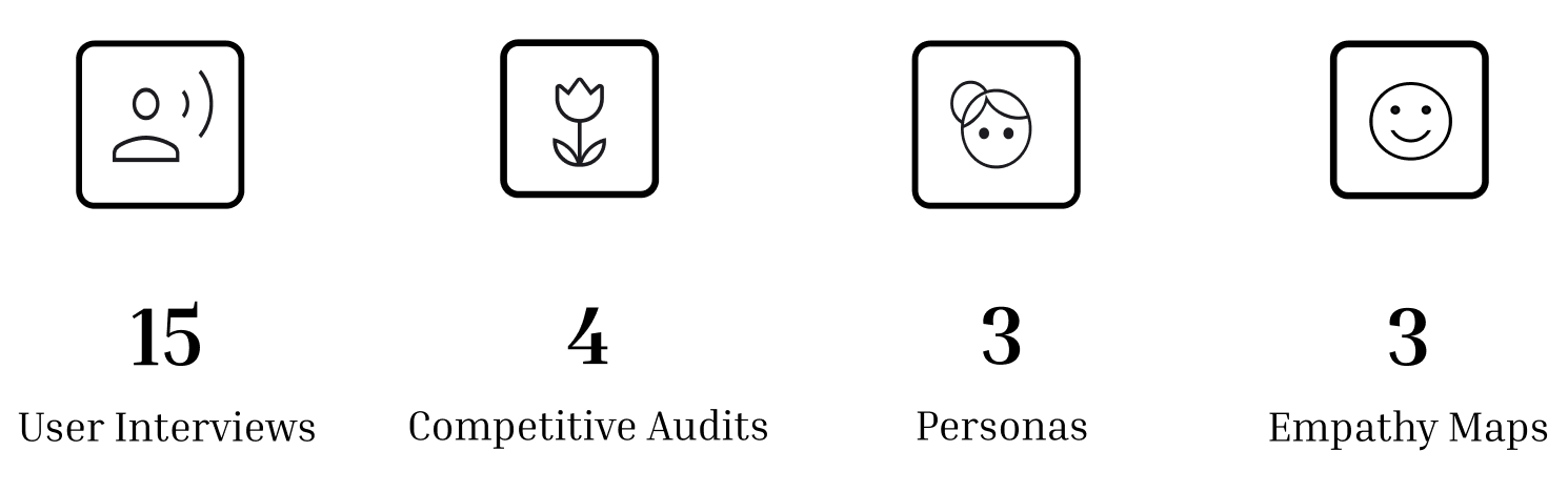
Users expressed several pain points while using online flower websites.

Then I created empathy maps and personas to understand the users on a deeper level and design a product that resonates with them.


Now it was time to do market analysis to see what other flower websites had to offer, what works well for them etc.
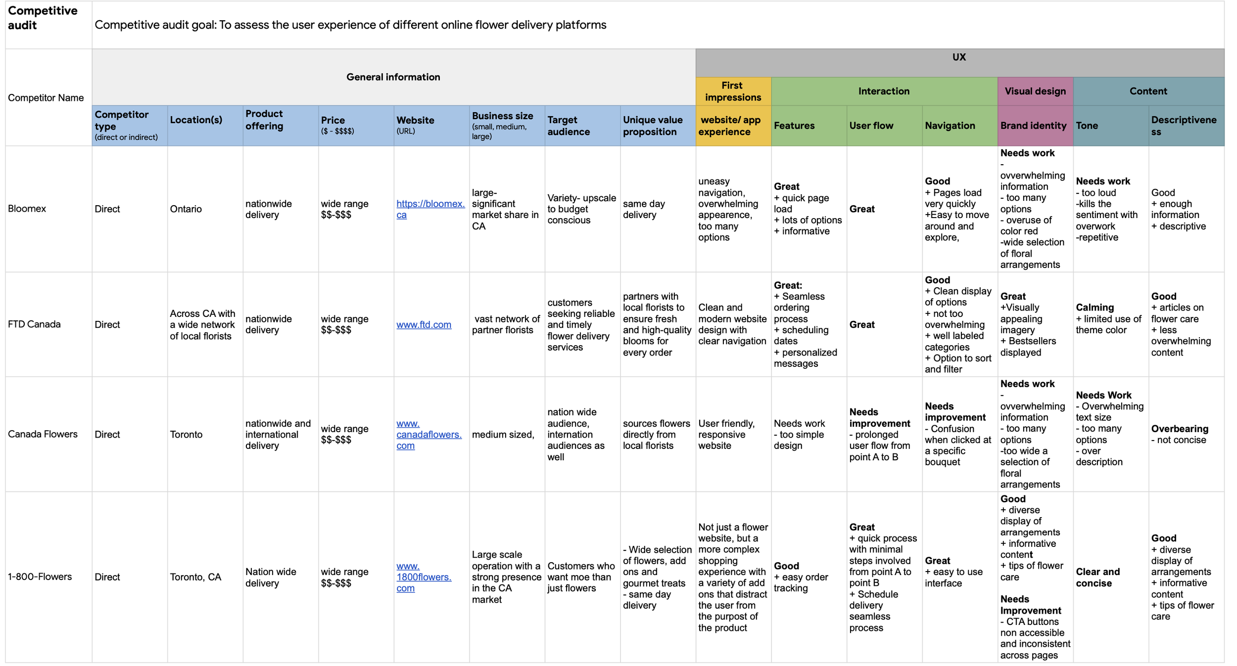
So now I have a better understanding of the products available in the market and where opportunity lies in creating a responsive website that will cater to the user needs.

Now it’s time to brainstorm design ideas to create a good user experience for the target audience.

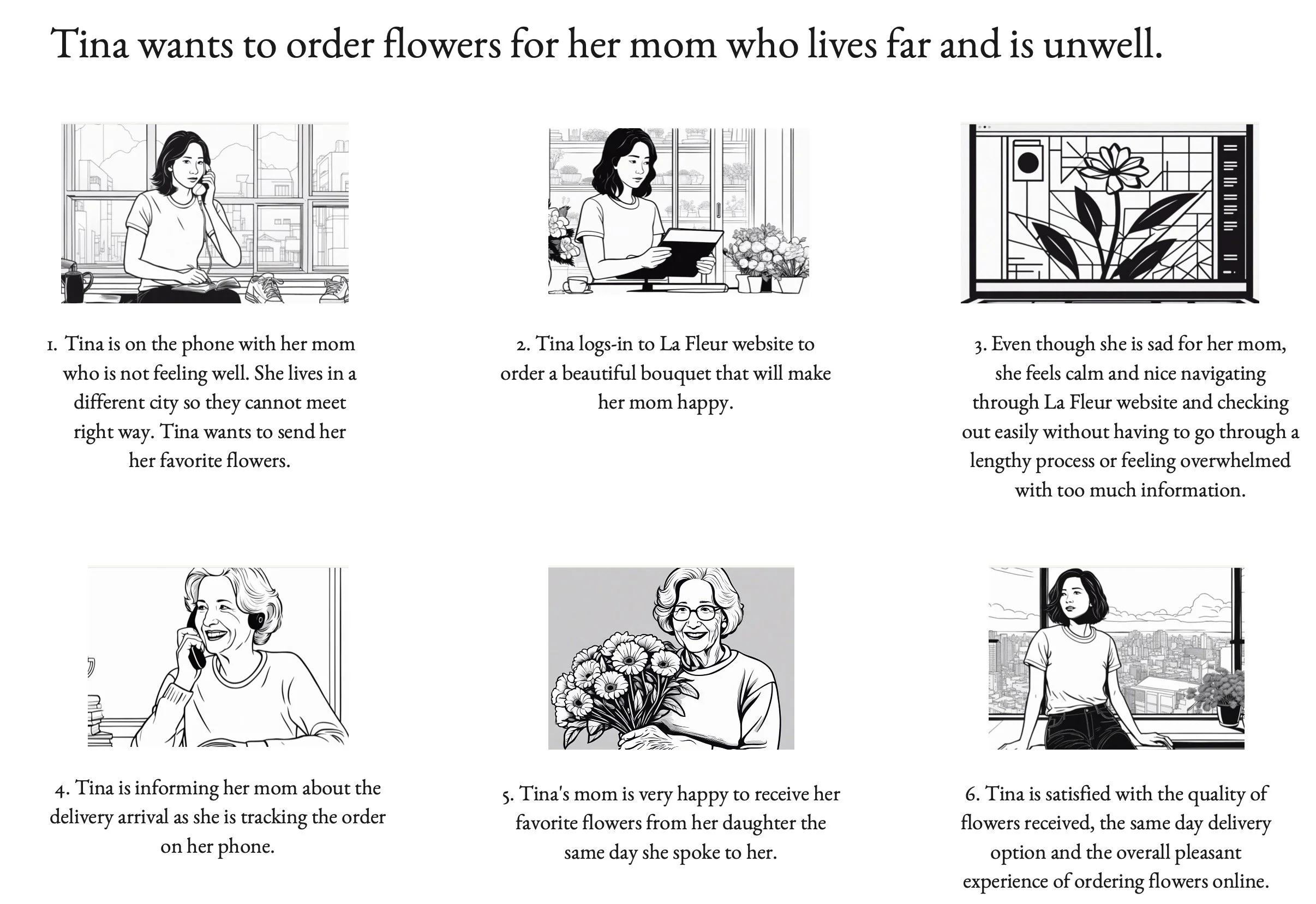
Through storyboarding, I was able to envision my user persona - Tina’s experience and journey from a point in her day when she decided to send flowers to her mom to the point where the delivery is made.
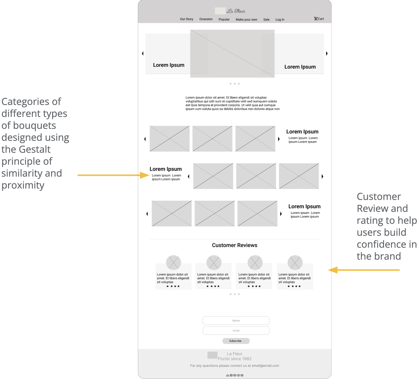
Through paper wire framing, I was able to go through various possible layouts of the website’s homepage and make design decisions for a good user experience.


Digital wireframes of the responsive website helped make the product look more realistic and make it easier for me to design to address user pain points.


Now it’s time for a crucial step - Usability Testing - to have users interact with the designs to uncover potential issues, validate design decisions, and ensure the final product meets their needs and expectations
Findings from the first study helped guide the designs from wireframes to mockups.
The second study used a high-fidelity prototype and revealed what aspects of the mockups needed refining.

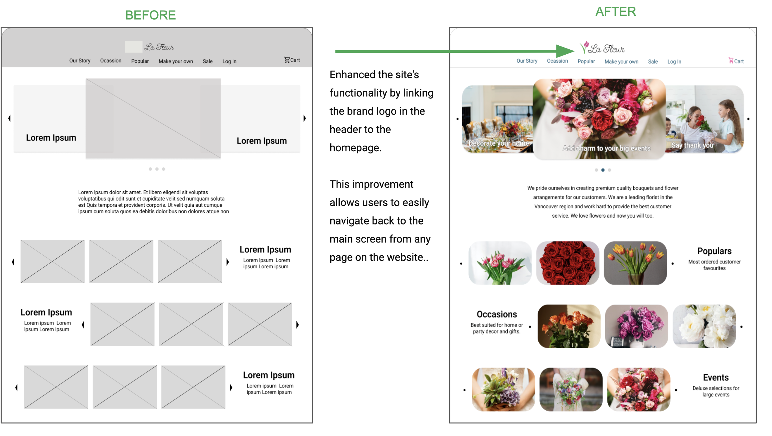
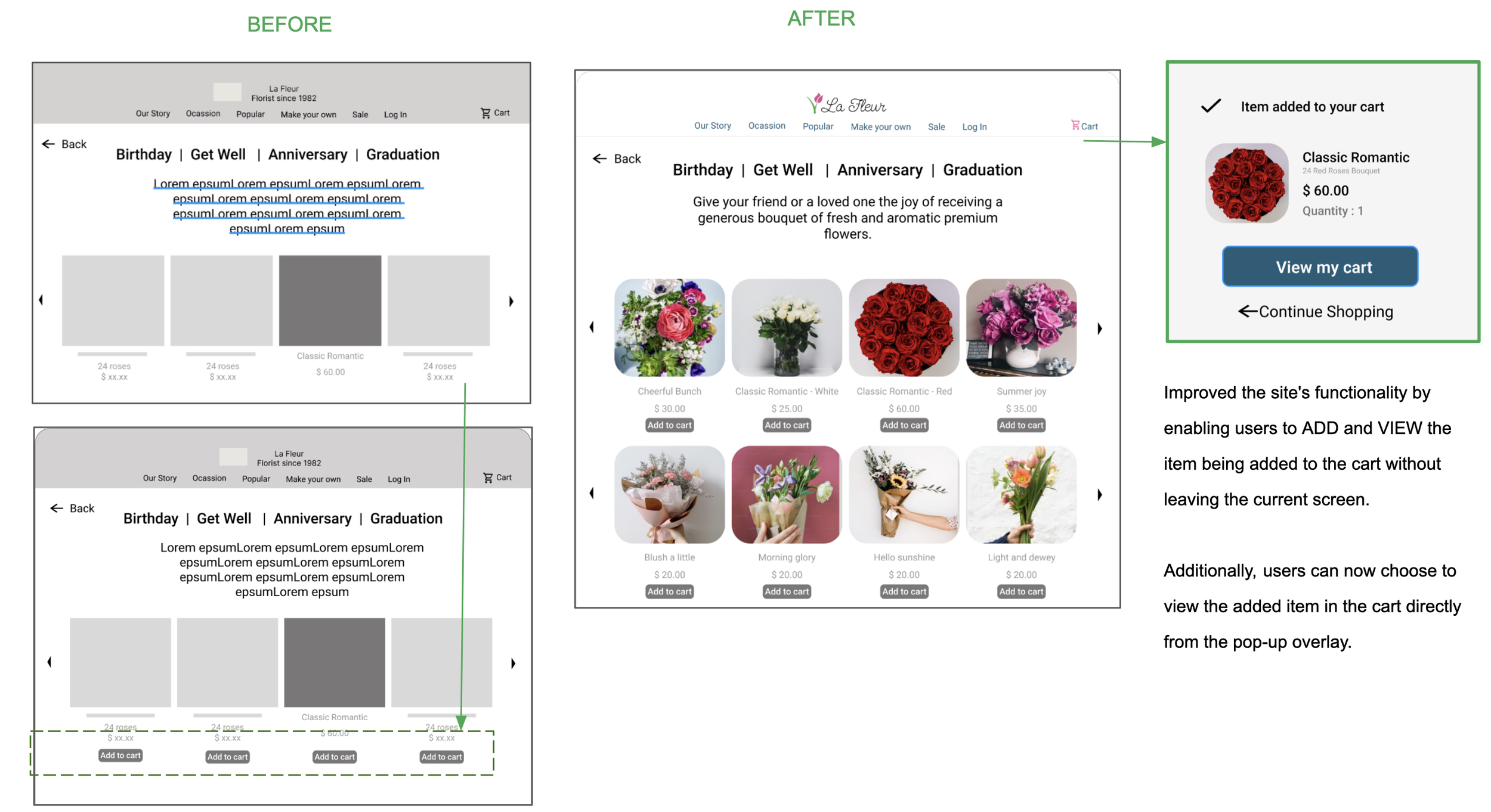
Design updates from Usability Study findings:


The final product!

Accessibility Considerations
Colors
The chosen colors comply with all the WCAG AA and AAA contrast ratio for normal and large texts:
Background #205D79
Foreground #FFFFFF
Background #FFFFFF
Foreground #205D79


Transitions
Implemented a gentle dissolve transition with a duration of 500 milliseconds when users interact with the website or app to mitigate sudden visual changes.
This helps users with visual sensitivities or motion-related disabilities to navigate the interface more comfortably, reducing the risk of disorientation or discomfort.
Typeface
The Roboto typeface is used throughout the website and app to make reading text easier for users with dyslexia and visual impairment
Designing the app revealed the dynamic nature of design, with constant changes occurring at every step.
Acknowledged the perpetual room for improvement throughout the design process.
Recognized the significant impact of usability studies and user feedback on shaping each iteration of the app's design.
Found enjoyment and satisfaction in the iterative nature of design, witnessing continuous improvement with each new version of the website.
What I’ve learned
Continue to conduct rounds of usability studies to ensure all user needs are catered to.
Next Steps
Add order tracking feature with the order number.
Conduct more research to increase accessibility of the website and app.
Would be happy to discuss more over a chat!

PROJECT LOONIE

THE KITCHEN